Superman's New Logo Hints at James Gunn's Approach
Superman's new logo offers some hints toward James Gunn's approach to The Man of Steel.
"I'm fascinated with the stories that we tell. Real histories become fantasies and fairy tales, morality tales and fables. There's something interesting and funny and perverse about the way fairytale sometimes passes for history, for truth." – Kara Walker (Dazed, 2013)
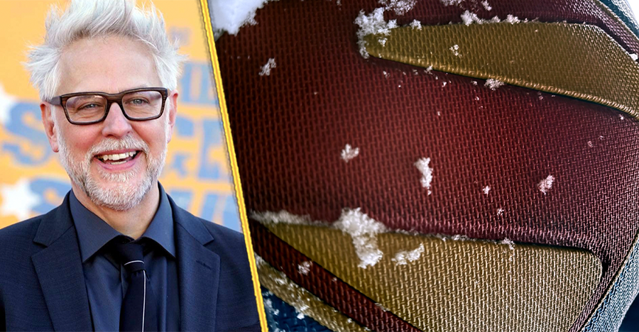
James Gunn has revealed the first look at David Corensweat's version of the Superman crest. On social media, the response has been mostly positive. Earlier in the production process, fans asked the DC boss what Superman's suit would look like. Gunn would reply that his take on The Man of Steel would bring together the past and present. (He ended up telling almost the exact truth! It's a mix of the past, present, and future.) I confess that as someone rooting for as classic of an approach as possible, it does look pretty darn snazzy.
However, there's one very tall building that the now-renamed Superman will need to bound in order to carve its place in the comics movie pantheon. Namely, how do you balance the past, present, and future to present a vision of Superman for a modern audience. Gunn's instinct, and the marketing brain up there, are off to a good start by focusing on the El family crest. Despite some interpretations of the character saying that the logo means hope, it really serves as a silhouette for fans to paste their own meanings on.
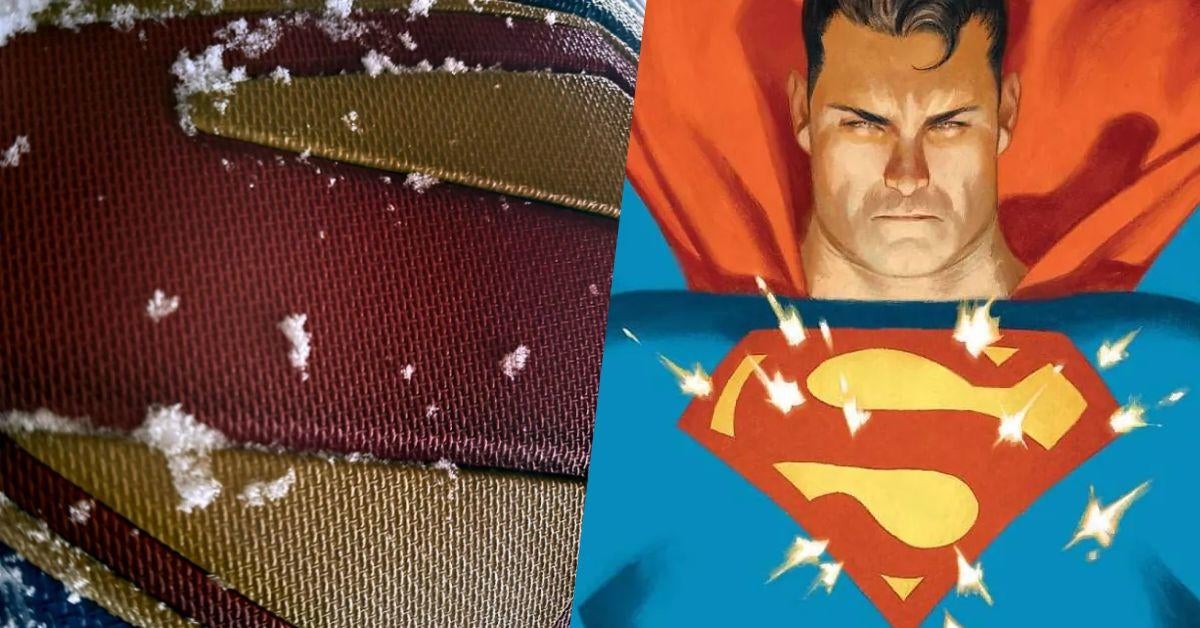
Back in '2021, DC Editorial added Truth, Justice and a Better Tomorrow as Superman's catchphrase. But, the press release for this Superman movie says 'He is the embodiment of truth, justice and the American way, guided by human kindness in a world that sees kindness as old-fashioned.' Now, that all sounds very nice. But, it's nostalgic in a way that immediately sent my antennae skyward. Of all the mainstream superheroes Superman is arguably the most nostalgia-driven. Everything about The Last Son of Krypton is tied to the 20th century in a lot of ways.
And, there lies the rub. That past Superman traditionally harkens to is imagined. Artificial in ways that would make a soft drink company blush. From that understanding as a starting point, the idea of the shield as a silhouette takes shape. Yes, there's the presence of an S there, but it's hysterically hard to pin down because of the expansive history of the character. There are infinite iterations of Superman and as a result, Clark Kent often gets boiled down to his easily-defined features. The imagined past takes over. Truth. Justice. The American Way.
The imagined past is faster than a speeding bullet and more powerful than a locomotive in our memories. It looms larger than life itself and persists through the scattered nature of human recollection. We lose recipes faster than ever and the cookbook's been burned for the most part. Despite the heat-seeking missile of fan expectation for a "normal Superman story," Gunn and the filmmakers are banking on using that confined palette to their advantage.
A Flattening of Superman As An Idea
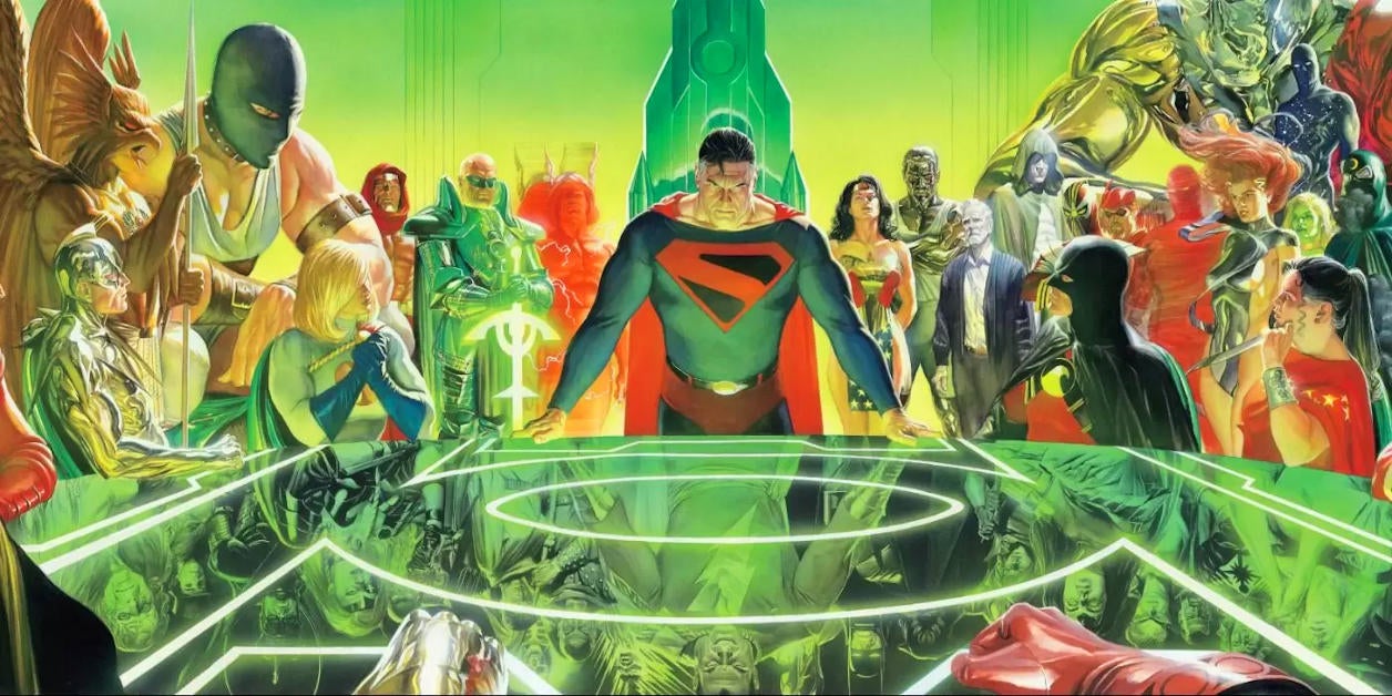
Fans first got tipped off to something being different with this take on Superman when the movie's table read images got onto social media. One quick look at the name cards for the actors and people noticed a big clue. Superman's crest looked closer to Kingdom Come's design or Superman and the Authority. Those are two very different takes on the DC icon. Ones that would have been a little bit less accessible for casual fans. DC was going to have to flatten that out a bit. It's telling that when we got the final design this week, it used them as reference points but managed to get that yellow in there.
Despite being two very good Superman stories, they don't scream the popular conception of the character that lives on lunchboxes. First of all, black and red with none of that cheery yellow? Not gonna happen. This is Superman's big re-launch in the public eye. There was no way this nostalgic tale about Clark Kent was going to forgo the yellow. (Wait until the general public figures out about the briefs/shorts discourse.) Gunn knows the assignment was to deliver "classic" in one way or another. The first Superman movie had the same task at hand.
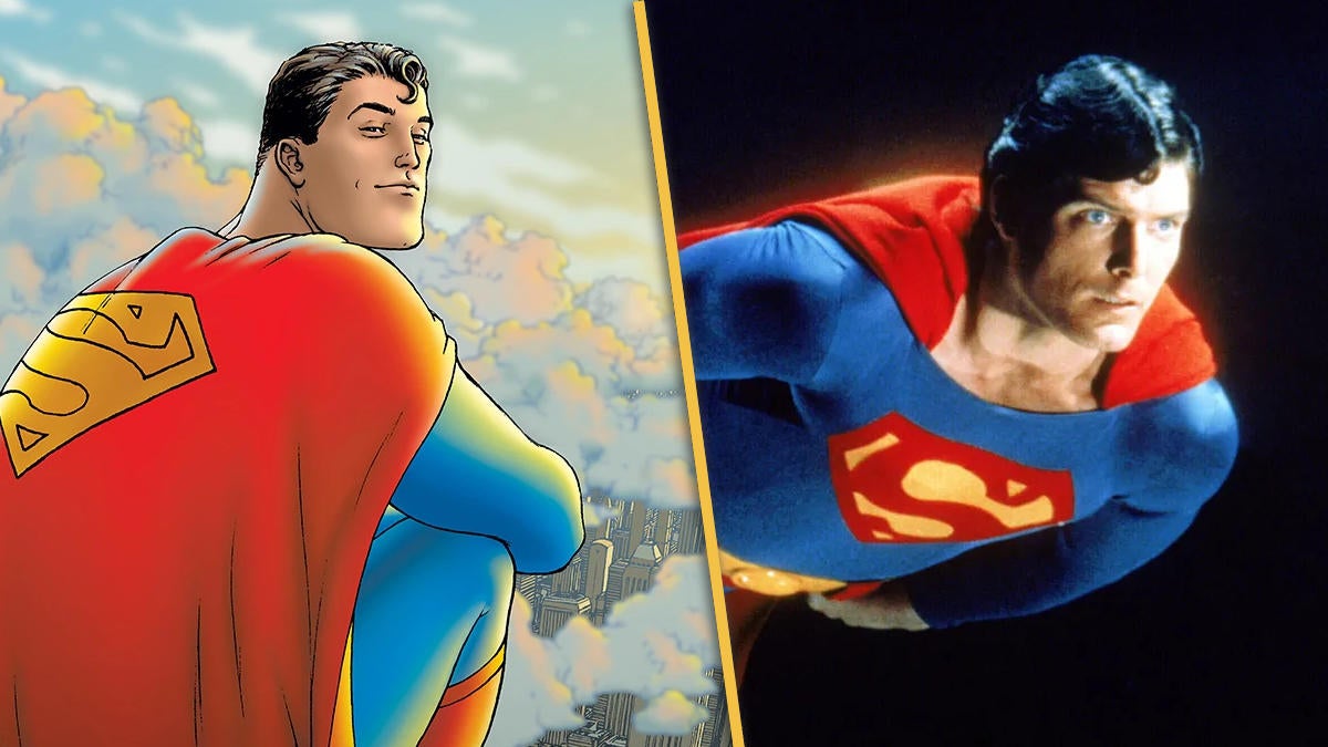
Superman costume designer Yvonne Blake gave a talk at The Museum at FIT back in 2013. She described making the now-iconic live-action Superman costume. "The costume could obviously never be changed," Blake said. "It was a question of reproducing what looked like a pretty silly costume into one that could be worn by an actor that would look attractive and believable to Superman fans... I tried to make the costume appear as seamless as possible. Tried to hide the fastenings and stitchings where possible."
And that's key to the character at large. Superman is supposed to be uncomplicated. He's summarily good in a way that Batman, Spider-Man, Wonder-Woman, the X-Men, and God knows Iron Man are not all the time.
So, how do you marry those two distinct aesthetics with a more approachable face of the character? Nix the black and turn up that yellow. In silhouette, the absence is meant to be filled in by the audience. For the Superman logo, it's a mirror reflecting back that golden hour glow from a universe that looks a bit like our own but couldn't be further from the truth.
Chaining Superman To The Future
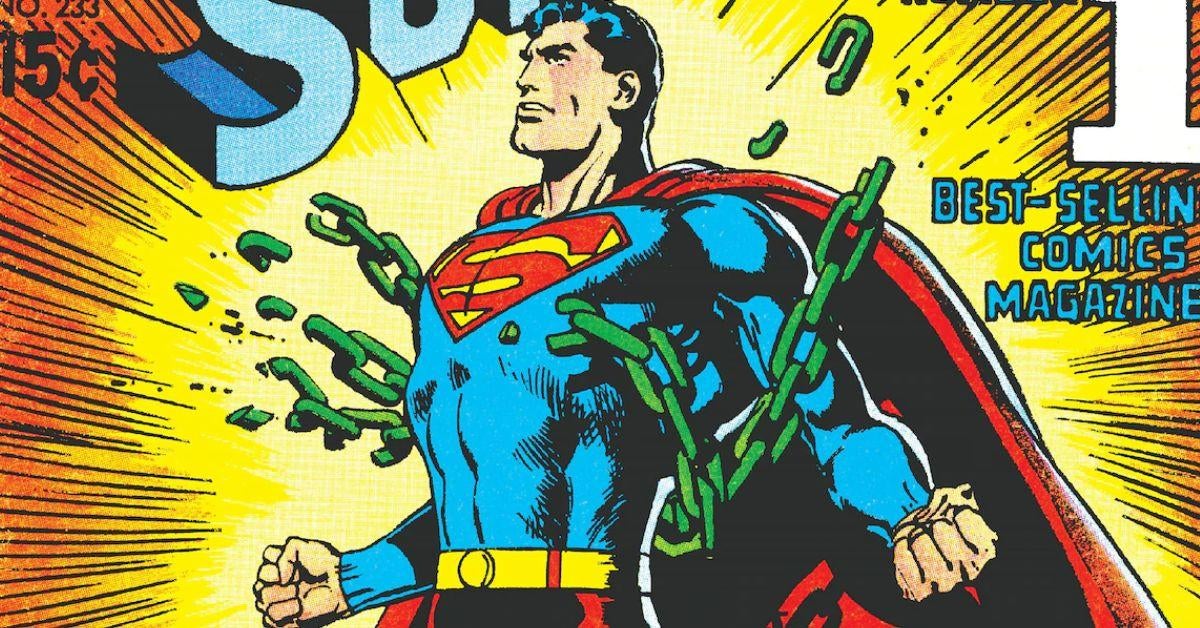
A question that springs from all of this is how to bring a character like Superman into the present? He's so thoroughly anchored to the past that a creator has to fasten him to the present and get ready for the ride. The director and the team making this movie are aware of what their task is. It remains to be seen how it will all shake out. But, Gunn's message on Instagram that accompanied the announcement of the crest tips his hand for the audience.
"When I finished the first draft of the script, I called the film Superman: Legacy," Gunn typed. " By the time I locked the final draft, it was clear the title was SUPERMAN. Making our way to you July 2025."
This utterance is interesting because it lays bare a key function of icons. They fold the content built onto them into the original article. Can you really have Superman return if our American psyche can't shake him? It's going to be rough. You can call him by another one of his nicknames. But, the second he deviates from expectation, there will be some discourse waiting for you. The strategy at play has to be a little more subtle than that. After all a silhouette is not necessarily a shadow, it might not move unless forced.
I'm willing to give Gunn some credit because the other part of the movie's synopsis sneaks in some of the modernity necessary to make this iteration stand out. Superman "tells the story of Superman's journey to reconcile his Kryptonian heritage with his human upbringing as Clark Kent of Smallville, Kansas."
Balancing two different cultures and worlds is going to be fertile ground. While other movie adaptations of The Man of Steel have touched on this, foregrounding it is a smart move. Because Superman is going to be wearing the shield juggling those expectations and trying to be a hero for an entire nation with a diverse pool of citizens. Because of that, his universality is a strength instead of something to quirk your eyebrow at. Being a blank slate might be the best position to be in. If anything, it could be a shape of things to come.
Do you like the new Superman design so far.? Let us know down in the comments!
1comments